More Design Tips
- • How “Category Creators” Inspire and Empower Customers
- • Draw People into Your Story with the Rule of Three
- • Three Steps to Great Design
- • Overcoming Obstacles in Design
- • Try Word Lists for Advertising “Gold”
- • Building the Perfect Letterhead
- • Attract Magazine Readers with Short-Form Columns
- • Essential Dos and Don’ts for Adding Beauty to Your Page
- • Grab Them Right Out of the Gate
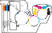
Use Color Contrast to Trick the Brain
What would you say is the primary organ used for your sense of sight?
While many would quickly answer that question with "the eye," it's actually your brain. Why?
Because while your eyes do collect visual information, your brain is the mastermind behind it that interprets the data in a way that is meaningful to you.
You can manipulate the brain to your advantage in your designs by merely adjusting the hue, value, and saturation of different colors.
Color Theory Basics
As you get started with your next design, revisiting some basics of color theory can be helpful.
Did you know that the human eye adjusts when focusing on colors of different wavelengths? This is why colors with longer wavelengths appear closer while those with shorter wavelengths seem more distant.
Cool colors (blue, green, purple) seem to recede, while warm colors (red, yellow, and orange) seem to close in or advance. In multicolor compositions, contrasting colors can create all kinds of movement.

Here are some other brain-manipulating techniques you can experiment with on your next print project.
1. Create More Contrast
The greater the difference between a figure and its backdrop, the more sharply defined (or near) a figure will appear to be. A dark figure will come forward (toward the viewer) on a light background, while a light object will possess more depth when placed on a dark background.

2. Experiment with Different Hues
On a dark blue brochure, a light blue subheading will advance slightly, but a bright yellow headline will leap forward. If your background and foreground are similar in hue (like a hot pink background with yellow font), the yellow will read much cooler than it does on dark blue.

3. Use Dull, Neutral Backgrounds
Using backgrounds like tan or grey when you want to draw attention or create a primary focus in your design. Dropping nearly any color on these muted shades can make your focal point sing!

4. Influence the Way Viewers Perceive Size
Did you know an object in a lighter color seems larger than an equally-sized object in a darker color?

Here’s a more real-world example: a political advertisement contrasting two people may use a photo of the opposing candidate wearing a blue shirt positioned in front of a cool green background. Next to this photo, the favored candidate wears a gleaming white shirt while placed before a dark blue background. Though the portraits are equal in size, the white to blue contrast exerts a visual force on the eye that makes the favored candidate seem larger. This gives “the good guy” a substantial, energetic persona that dominates the page!
Every element in your design exerts a visual force that attracts a viewer’s eye. Use color contrasts to make your products advance, to increase the weight of your focal point, and to stir an emotional response in your audience.


Understanding Color: An Introduction for Designers 5th Edition
by Linda Holtzschue
THE PERCEPTION, UNDERSTANDING, AND USES OF COLOR—EXPANDED AND REFRESHED
Understanding Color is an essential resource for those needing to become proficient in color for business applications. The peerless treatment of this critical subject is beautifully illustrated with real-world examples. Designers have turned to this guide for nearly a generation for its authoritative and accessible instruction. The knowledge contained in this book sets you apart from other designers by enabling you to:
- Contribute more effectively to discussions on color harmony, complete with a vocabulary that enables in-depth understanding of hue, value, and saturation
- Apply the most-up-to-date information on digital color to your projects
- Address issues involved when colors must be translated from one medium to another
- Troubleshoot and overcome today's most common challenges of working with color
Full-color images showcase real design examples and a companion website features a digital workbook for reinforcing color concepts. From theory and practical implementation to the business and marketing aspects, Understanding Color helps you gain a deep and discriminating awareness of color.


Share this