More Print Tips
- • Maximum Impact: Is it Best to Send a Postcard or a Letter?
- • Drive Rapid Response to Your Direct Mail: 10 Pro Tips
- • The Usefulness and Utility of Print Marketing
- • Boost Sales with Brochures
- • 5 Opacity Tips You Should Know
- • The Window to Marketing
- • Profitable Postcard Marketing: Finding the Right Frequency
- • 3 Fundamentals for Nailing Your Direct Mail Marketing
- • Picking the Perfect Paper
Paper Shifts Color: Orange is the New Red
Have you ever been to a restaurant and all you wanted was a simple breakfast? Just when you thought you had your order all planned out, your waitress hits you with a rambling of options. Would you care for white, wheat, rye, or pumpernickel bread? Do you want those eggs fried, scrambled, poached, green, with a side of ham? Sometimes, the choices seem endless.
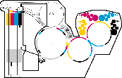
When it comes to printing, sometimes your options can feel a little like that, too. Take spot colors, for instance. Any colors that fall outside of the normal range of CMYK inks are commonly called "spot colors." Where CMYK colors use a blend of four specific inks - Cyan, Magenta, Yellow, and Black to create a wide range of color, spot colors are actually pre-mixed using a unique formula to create one, specific color. As you start to learn more about spot colors, one of the things you'll notice is that just like your breakfast options, there are a number of different acronyms and options that you're somehow supposed to be able to keep track of. Would you like coated, uncoated, or matte? Huh? Thankfully, they have pretty straightforward explanations.
C vs. U and Beyond
The acronyms C and U refer to "coated" and "uncoated." The key thing to remember here is that when used in reference to spot colors, they're actually talking about the paper and not the ink. Ink is made up of pigment (the color) and the carrier, which is usually oil. The oil part of the ink soaks into the paper and dries. The pigment sits up on top of the mineral or clay coating with coated papers, but soaks into the fibers with uncoated papers. Because the type of paper you're using can have a pretty significant impact on the way the ink color appears in real life, it's something you'll want to try and keep track of.
Here's an example of what coated versus uncoated paper would look like. You can see how the coated paper provides some extra "shine."


That "shine" will affect how spot colors are displayed, so keep that in mind when making your paper choice.
Furthermore, if you were to compare the colors PANTONE 185C and PANTONE 185U side-by-side, for example, one of the first things you would notice is that PANTONE 185C looks a little brighter and a little more saturated than the PANTONE 185U version. You're still talking about literally the exact same ink, but the difference between coated and uncoated stock changes the way that ink ultimately looks when printed. Pretty fascinating, and pretty important to remember when making your decisions!

"M" stands for matte. Matte coated or dull coated papers are still coated with a mineral coating, so the ink colors typically look closer to the C or coated version, but keep in mind that these papers are not as bright and tend to make the color ink look a little more subdued.
Pretty simple, right?
Two other acronyms that you might encounter are CVU and CVC. The "CV" letters stand for "computer video" and are largely used to reproduce colors on a computer screen. Adding a "U" for uncoated or "C" for coated indicates which paper type is being simulated on the computer screen.
Hopefully, by now you've realized that your options aren't nearly as hard to work with as you thought they were. Remember that these options, even though they're used in conjunction with the ink are actually talking about the paper. The ink, for the most part, is the ink is the ink, but the paper is a whole different story. Select your swatches in any way you see fit, but remember, ultimately the type of paper you choose can make something darker, less saturated, more saturated or something else entirely.


Real World Print Production with Adobe Creative Cloud (Graphic Design & Visual Communication Courses)
by Claudia McCue
Sharpen your print production skills with this definitive resource created specifically for design professionals who need to create files using the Adobe Creative Cloud, including InDesign, Photoshop, Illustrator, and Acrobat and output for printing.
The previous edition was steady seller, helping designers who have no training in print get up and running quickly and not make expensive mistakes on their projects. Completely updated for CS6 and the CC, this book also helps designers with some print experience tackle more complex projects. The book covers all the Adobe Suite programs they need to know to produce successful projects, rather than buying 4 or 5 different books.
This book is considered the complete resource for understanding the print cycle, how ink works on paper, managing fonts, using color spaces, handling images, and preparing files for print or electronic output.
Print expert Claudia McCue shares her hands-on techniques to prepare files, edit photos and graphics, and prevent common problems without missing a deadline. This book is brimming with insightful advice, illustrations, and shortcuts that will have you quickly and professionally producing your work in no time.
Covers: Acrobat XI, InDesign CC, Photoshop CC, and Illustrator CC for Macintosh and Windows

Share this