More Print Tips
- • Maximum Impact: Is it Best to Send a Postcard or a Letter?
- • Drive Rapid Response to Your Direct Mail: 10 Pro Tips
- • The Usefulness and Utility of Print Marketing
- • Boost Sales with Brochures
- • 5 Opacity Tips You Should Know
- • The Window to Marketing
- • Profitable Postcard Marketing: Finding the Right Frequency
- • 3 Fundamentals for Nailing Your Direct Mail Marketing
- • Picking the Perfect Paper
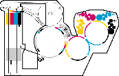
Make a Splash With Creative Overprinting Techniques
Creating dimension in a one-dimensional print project can take some serious creative brainpower. Generally, printed items are planned with colors that do not go on top of each other, as this can sometimes cause an unexpected effect or colors to look "muddy."
With overprinting, however, you can work with your designer and printer to make a conscious decision to mix colors together by printing one on top of the other to form a new and interesting level of detail. While the final result depends on how your project is implemented, overprinting can provide a measure of depth that is often missing in projects that are printed on a flat piece of paper. See how creative overprinting techniques can be worked into your next print project!
Knockout vs. Overprint
Traditional design software automatically creates a knockout of any text or lines that are overlapping one another, so you're able to see the crisp, clear edges in your printed product just as you see them on your screen.

If the colors are overprinted, or overlapped, you have the opportunity to create an additional color and some added excitement besides. Type is one of the key items used in an overprint situation. While knockout text can be impactful, overprinting adds some dimension or thickness to the paint that is visible to the brain, even if your eyes don't register the difference. This slight trick of thickness makes the image appear to jump off the page and creates a completely new look from traditional printing.
Order of Colors Matters
One thing that's important to keep in mind with overprinting is the order in which the colors are applied to the canvas. If you're purposefully overprinting several colors, you wouldn't want to design your project with the lightest color in the back, for instance. The darker foreground color could easily overwhelm the lighter shade, causing an unexpected result. The colors will be printed in exactly the same order as the artwork, which is why it is critical to have someone who truly understands design and printing create your artwork to ensure a consistent result for your printed materials.

Just like every other creative approach to printing, you don't want to go overboard with overprinting. However, when used judiciously, you can create some really intriguing designs that would be much more difficult or expensive were you to use traditional printing techniques. A perfect example is with PMS colors where there might be a color match charge for each color. With overprinting techniques, you can technically get a third color without having to pay for an additional imprint!
Want to learn more about creating cool color effects using overprint techniques? Contact us today to get started on your next project!


The Production Manual
by Gavin Ambrose and Paul Harris
From the basics such as working with typography through using images and working with color, exploring different pre-press techniques and the processes involved in bringing a product to press and with a resulting pleasing end product, the authors present everything that the reader needs to know in a straightforward and visually strong way. This new edition completely updates the information on the production process, highlighting new techniques and expanding its coverage on digital technologies. In addition, new interviews are included from design studios using creative or unique production techniques. Since students may eventually be working with international clients, the authors includes both metric and imperial measurements so that students will become familiar with the differences. Expanded coverage of environmental and sustainability issues, especially as they relate to paper choice and use of special processes/inks has also been added.

Share this